Benefits of a Limited Colour Palette
Have you ever felt overwhelmed by all of the colour choices that are available to us today?! Where to start, what colours to pick, which colours look good next to one another, why is a certain colour more appealing to you than another, how to use colour in a harmonious way, and how to limit colours for a Contemporary aesthetics. I have created a formula that will help you answer all of these questions!
The Significance of Colour
Colour has always been a big part of who I am. From early years I would intuitively pick colours that made me happy. Later as a teenager I would pick certain colours to paint my bedroom walls with, going through a number of colours realising that although a colour looked joyful in the tin when I surrounded myself with it, it achieved the opposite. I was wondering why, until I picked a colour that felt most natural to me since I was little and that colour remained my favourite colour to this day, it's the colour of the ocean: turquoise!
There are colours that we may think look good, but that does not mean they are "our" colours. Lets discover what "your" colour is in this journey of colour exploration!

Warm Up
Any art process should start with a playful exploration of colour and art supplies. Even if you just choose to work with watercolour or any other medium, try to experiment with textures and opacity. Having a small sketchbook is crucial for some guilt free swatches and mark making.
During these easy swatches and mixes it is often where the magic begins!

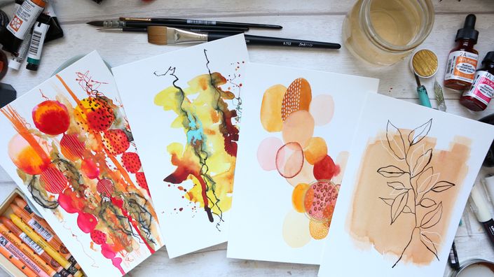
Step by Step Projects
There will be three finished paintings that we will create. We will start with an abstract to loosen up, and move onto modern botanicals. All in real time and super relaxing, no music. There is just under 5 hours of content broken down into max 15 minutes bitesize classes for your convenience.
Even if you are very busy you still can find a little me-time, which we need now more than ever!

The Power of Colour
Colour is a very individual phenomenon. Why do we call certain colours "favourite" and yet can't stand others? Have you ever asked yourself what is it about a colour that can make you feel happy or indeed uncomfortable?!
When colour is used "correctly" it can have soothing and healing properties, often regarded as Colour Therapy.
Example Curriculum
- Introduction (11:42)
- Supplies (25:56)
- Supplies List PDF
- The Importance of a Sketchbook! (10:51)
- Colour Exploration PART 1 (7:55)
- Colour Exploration PART 2 (12:06)
- Colour Exploration PART 3 (10:47)
- Creating Limited Colour Palettes PART 1 (14:51)
- Creating Limited Colour Palettes PART 2 (14:58)
- Creating Limited Colour Palette PART 3 (12:22)
- Project #1 Abstract PART 1 (14:12)
- Project #1 Abstract PART 2 (14:13)
- Challenge: Your Least Favourite Colour PART 1 (9:40)
- Challenge: Your Least Favourite Colour PART 2 (9:45)
- Project #2 Watercolour Botanical (14:27)
- Project #2 Finishing Touches PART 1 (14:45)
- Project #2 Finishing Touches PART 2 (12:57)
- Happy Colour Palette (14:13)
- Project #3 Watercolour Botanical PART 1 (13:41)
- Project #3 Watercolour Botanical PART 2 (15:13)
- Project #3 Watercolour Botanical PART 3 (15:01)
- Project #3 Watercolour Botanical PART 4 (7:15)
- Colour Theory & Expanding Colour Tone (15:52)